

Orion Tech Operator and Fleet Analysis


made with Python, Chart.js, & ASP.NET
Executive Summary of Fleet Analytics Dashboard
This portfolio piece showcases a robust data analytics dashboard for "Orion Technologies," demonstrating a comprehensive understanding of business intelligence and its application to fleet management. The project effectively translates raw data into a dynamic, user-friendly tool that provides a clear and actionable overview of the company's vehicle and operator fleet. By focusing on critical Key Performance Indicators (KPIs) like in-service rates, status distributions, and comparative performance, the dashboard empowers stakeholders to monitor fleet health, optimize operational efficiency, and make data-driven decisions. The inclusion of interactive filters and trend analysis further highlights the ability to build flexible solutions that cater to various user needs, from high-level executives to on-the-ground managers. This project stands as a testament to my skills in data visualization, storytelling, and the creation of valuable business insights from complex datasets.
Key Standout Features
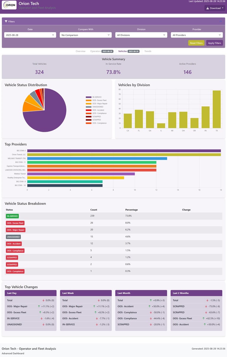
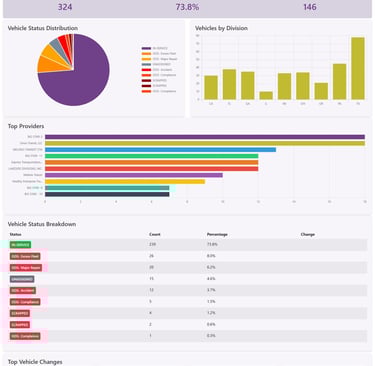
Actionable KPIs: The dashboard focuses on metrics directly tied to business outcomes, such as "In-Service Rate" and "Top Changes," proving the ability to identify and prioritize the most important data points for a business.
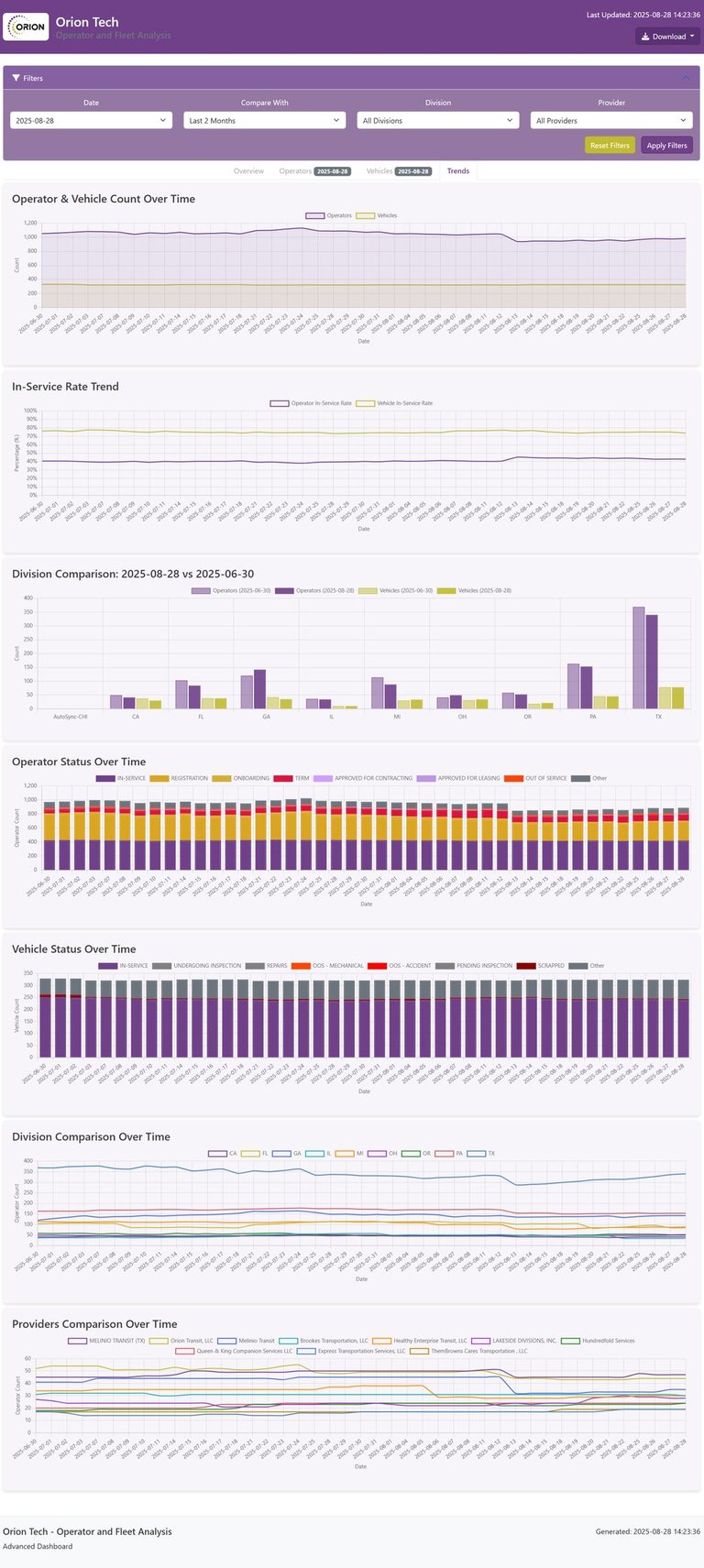
Advanced Analytical Capabilities: It moves beyond simple reporting to include sophisticated trend analysis and comparisons across different divisions and providers, demonstrating a strong grasp of data analysis techniques and the ability to uncover hidden insights.
Interactive User Experience: The use of customizable filters for date, division, and provider shows that the dashboard is a dynamic tool designed for a user's specific needs, not a static report. This highlights a focus on user-centric design and practicality.
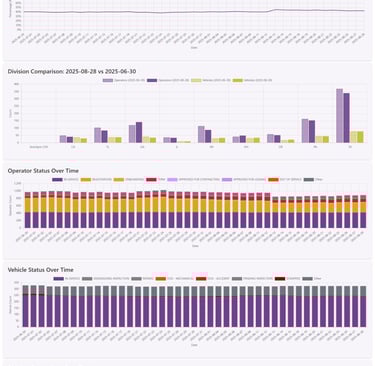
Comprehensive Data Visualization: The project utilizes a variety of chart types—including pie charts, line graphs, and bar charts—to effectively tell a compelling data story, showcasing a deep understanding of visualization principles and a talent for communicating complex information clearly.
Problem-Solving Focus: Features like "Top Changing Divisions" and "Top Providers" demonstrate the ability to not only present data, but to proactively identify potential issues or areas for improvement, positioning the dashboard as a proactive problem-solving tool.
Real-World Applicability: The dashboard is a fully-realized example of a solution for a specific industry need, proving the ability to apply data analytics skills to solve real-world business challenges.
Get in Touch
Contact us to discuss your analytics dashboard needs.


Contact
Connect
coreyleebass1990@gmail.com
+1-815-420-6660
© 2025. All rights reserved.